Components are a form-based type of content that gather information and add it into
complex design elements. A component on a page prompts you to enter information and
formats and displays the information on the page.
How to use components
Inserting a Component
Components can be inserted into any editable region inside Omni CMS. You can insert
a component inside of a snippet.
- Select a page for editing and open the JustEdit Toolbar by editing an editable region.
- In the Toolbar, place the cursor where the component is to be inserted and click the Insert Component icon.
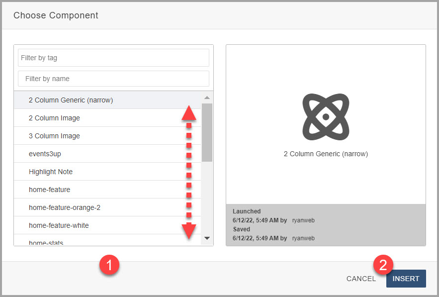
 In the Choose Component modal, select the component and click Insert.

- Fill out the component fields. Anything not marked optional is required, and must
be filled out for the component to be placed on the page.
- Click Save. The component is entered into the page with your answers.
- Continue editing the page, or save and publish for your changes to appear on the
live site.
Depending on the component settings, you either see the rendered component content,
or it displays as a blue placeholder.
Editing a Component
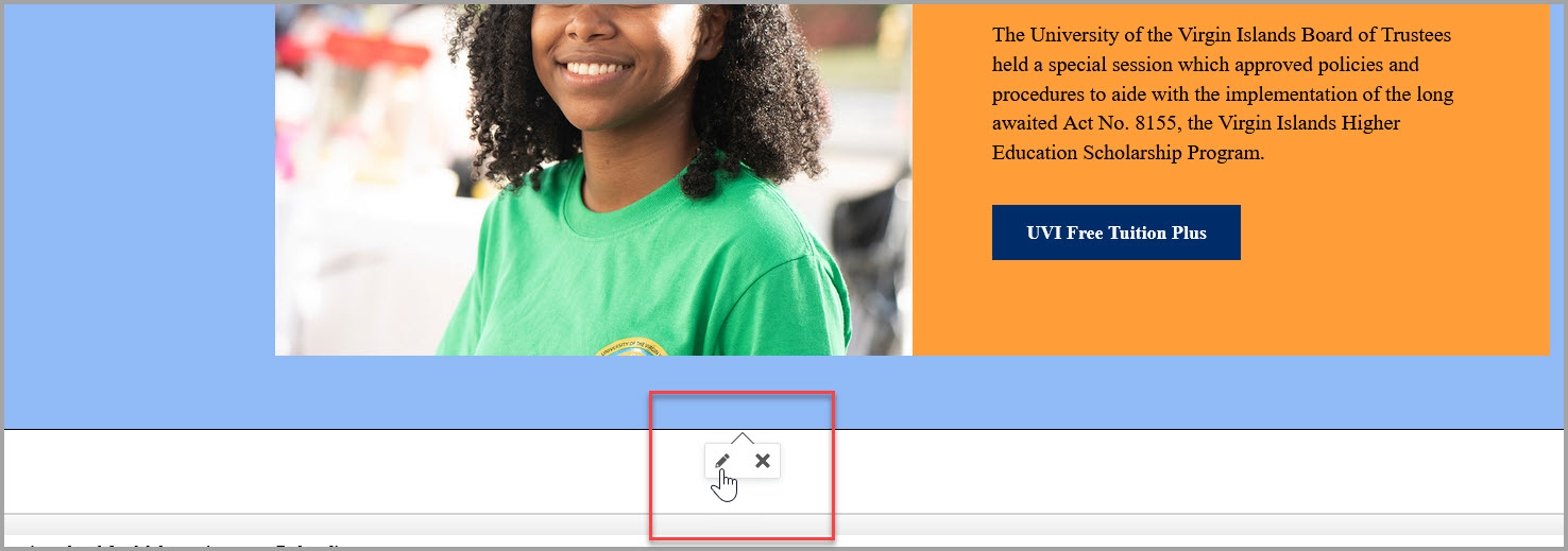
Click on a component to either edit the component answers (pencil icon) or delete
it from the page ("x" icon).

Ones you are done editing - click Save and Exit to view the component on the page.
Available Components
Choose from one of the following snippets to view examples and more.
Select snippet below:
- 2 Column Generic (Narrow)
- 2 Column Image
- 3 Column Image
- Events 3 Up
- Highlight Note
- Home Feature
- Home Feature Orange
- Home Feature White
- Home Stats
- Image with Caption
- Inline Image
- Primary Button
- Primary Button (Green)
- Quote
- Secondary Button
- Statistics 3-Up
- Story Quote Display
- YouTube Classic Player
- YouTube Video Component Player

