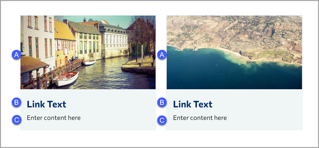
An image grid displays a list of images in a grid. It provides a consistent look and
feel that is responsive.
Learn how to insert a snippet, edit the content of a snippet, and delete it.
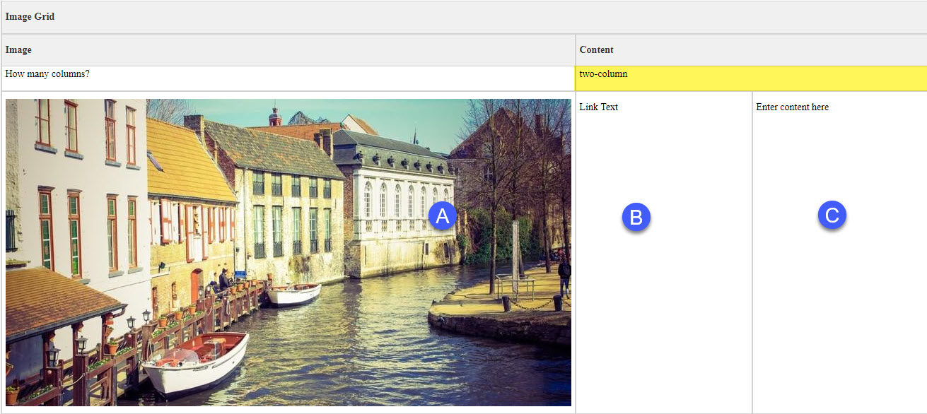
This snippet is edited through a table-based interface.
Grid items are added and removed by increasing or decreasing the number of table rows.
The text in the second column can be used to create a link in both the image and the text.
The maximum number of columns can be set.
Images are optional. But stay consistant. You may get undesired results if you mix grid items with and without images
Links are optional. You can leave as default.
Image Dimensions (By Pixels): 800px 435px
Alternatively, if the image has been resized closer to the recommended image size, a 16:9 crop in the Omni Image Editor should work. Note you might not get the exact dimensions, but at least try to match the width.
The image grid snippet is great for landing pages.
It is also great when you you don't have much content but want to simply display links on a page.
The image grid should NOT be used as an image gallery.


Contact us if you are having trouble, or need assistance.